Conic Gradient GeneratorCreate CSS conic gradients for pie charts, color wheels, and sweeping effects.
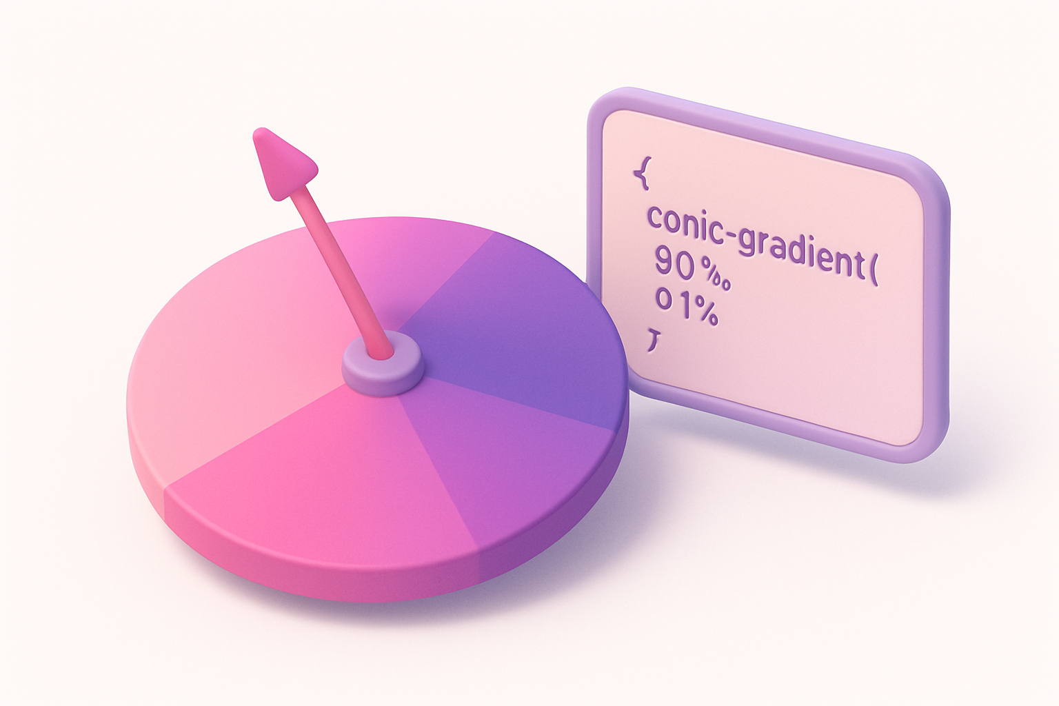
Conic Gradient Generator
Create CSS conic gradients for pie charts, color wheels, and sweeping effects.
Set Colors
Choose three colors for the conic sweep.
Adjust Settings
Set the start angle and center position.
Copy CSS
Copy the generated conic-gradient CSS code.
What Is Conic Gradient Generator?
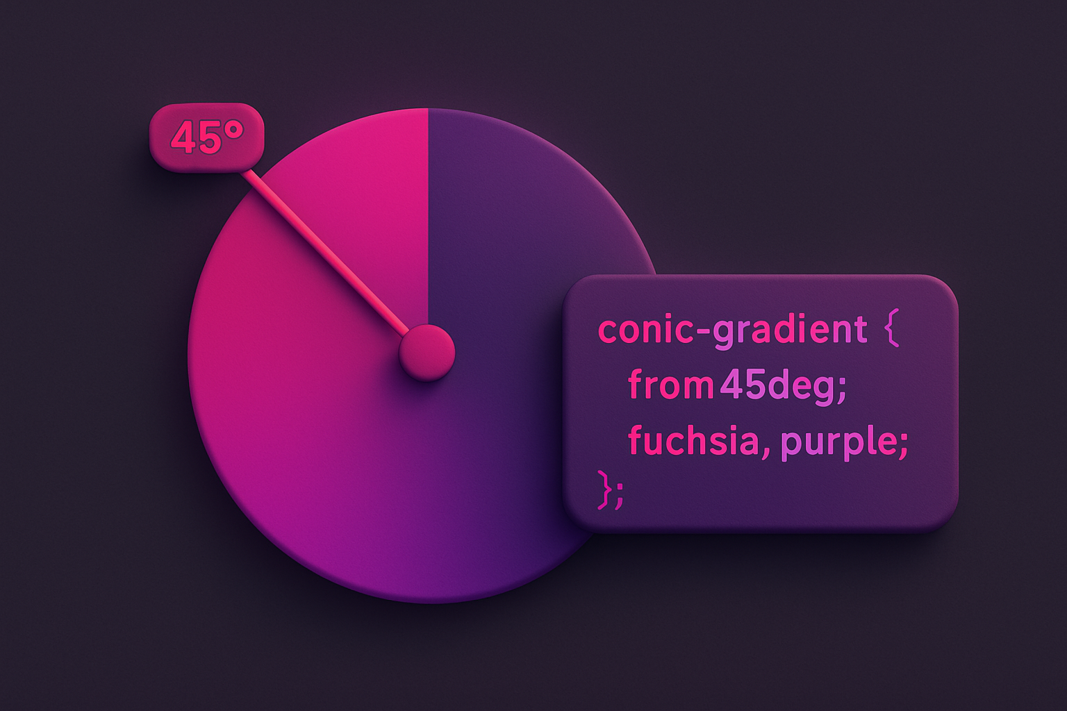
A conic gradient generator creates CSS gradients that sweep around a center point, transitioning between colors angularly rather than linearly or radially. Conic gradients rotate around a center point, making them perfect for creating color wheels, pie chart-like segments, clock faces, and sweeping color transitions. This tool lets you choose three colors, set the starting angle, and position the center point. The resulting CSS conic-gradient() code creates smooth angular transitions that wrap back to the starting color. Conic gradients are a powerful CSS feature that enables visual effects that would otherwise require SVG or Canvas, keeping your designs pure CSS and GPU-accelerated.
Why Use Our Conic Gradient Generator?
- Create sweeping angular color transitions impossible with linear/radial gradients
- Adjustable start angle for rotation control
- Custom center position for off-center effects
- Perfect for decorative backgrounds and data visualizations
- Clean CSS output for production use
Common Use Cases
Color Wheels
Create rainbow color wheel backgrounds using conic gradients.
Pie Charts
Build simple CSS-only pie charts with hard color stops.
Decorative Backgrounds
Create unique angular gradient backgrounds for sections and cards.
Loading Spinners
Design CSS-only loading spinners with conic gradient arcs.
Technical Guide
CSS conic-gradient() creates color transitions around a center point. The syntax is: conic-gradient(from angle at posX posY, color1, color2, ..., color1). The "from" angle rotates the starting position (default 0deg = top). Colors are distributed evenly around the 360° sweep unless explicit angle stops are specified. Repeating the first color as the last stop creates a seamless loop. For pie chart effects, use percentage stops: conic-gradient(red 0% 25%, blue 25% 50%, green 50% 75%, yellow 75%). Conic gradients are supported in Chrome 69+, Firefox 83+, Safari 12.1+, and Edge 79+. They can be masked with border-radius: 50% and combined with mask-image for complex shapes.
Tips & Best Practices
- 1Repeat the first color as the last stop for seamless circular transitions
- 2Use hard stops (same percentage, two colors) for pie chart segments
- 3Combine with border-radius: 50% for circular color wheel effects
- 4The "from" angle rotates the entire gradient — useful for animated effects
- 5Layer multiple conic gradients for complex patterns
Related Tools
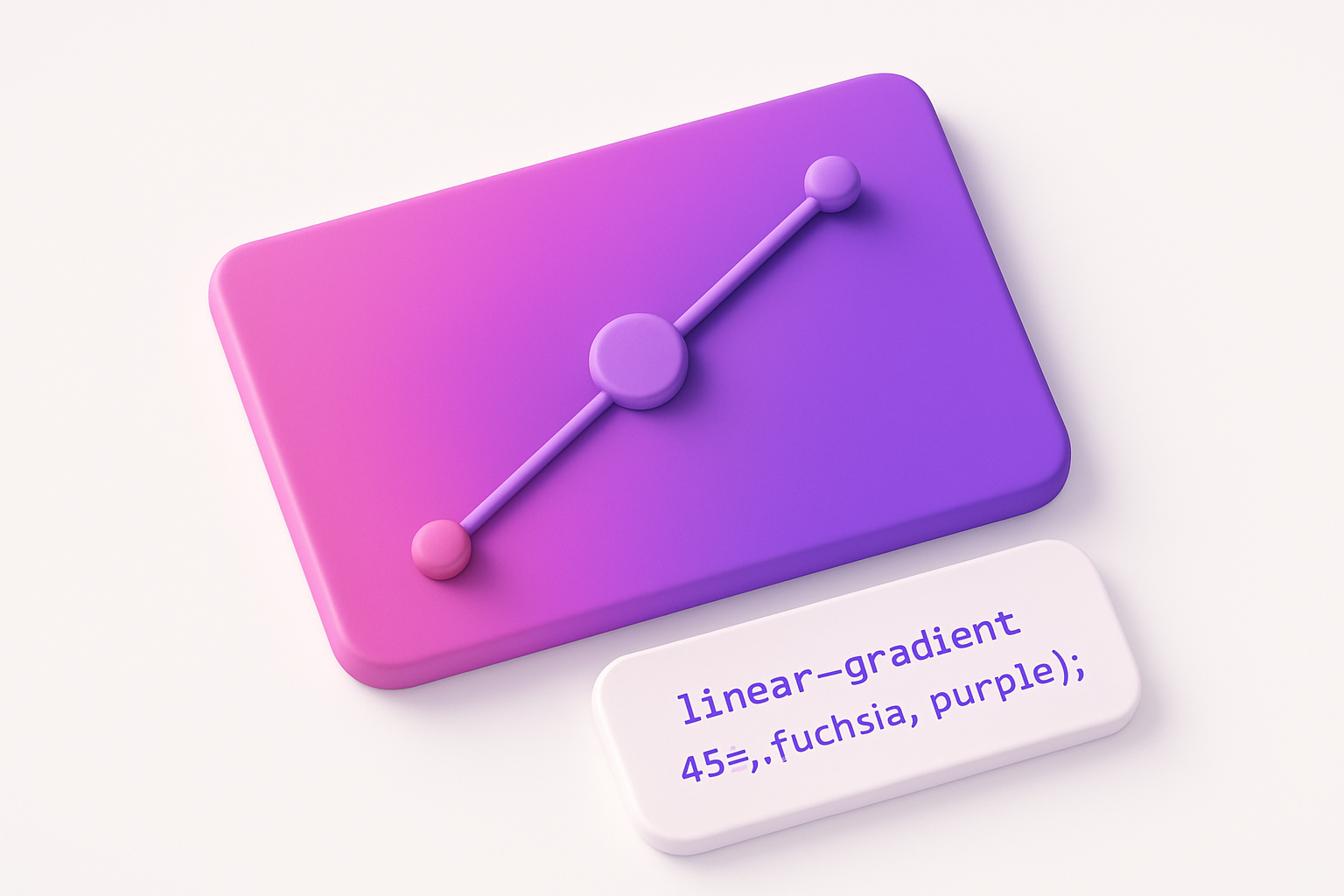

Linear Gradient Generator
Create CSS linear gradients with custom colors, angle, and color stops.
 Color Tools

Radial Gradient Generator
Create CSS radial gradients with custom shape, position, and colors.
Color Tools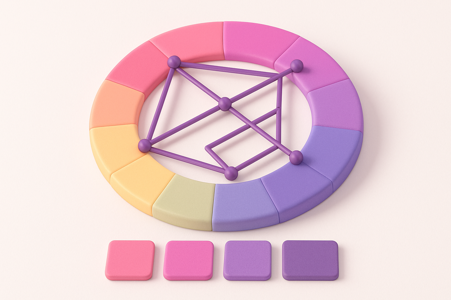
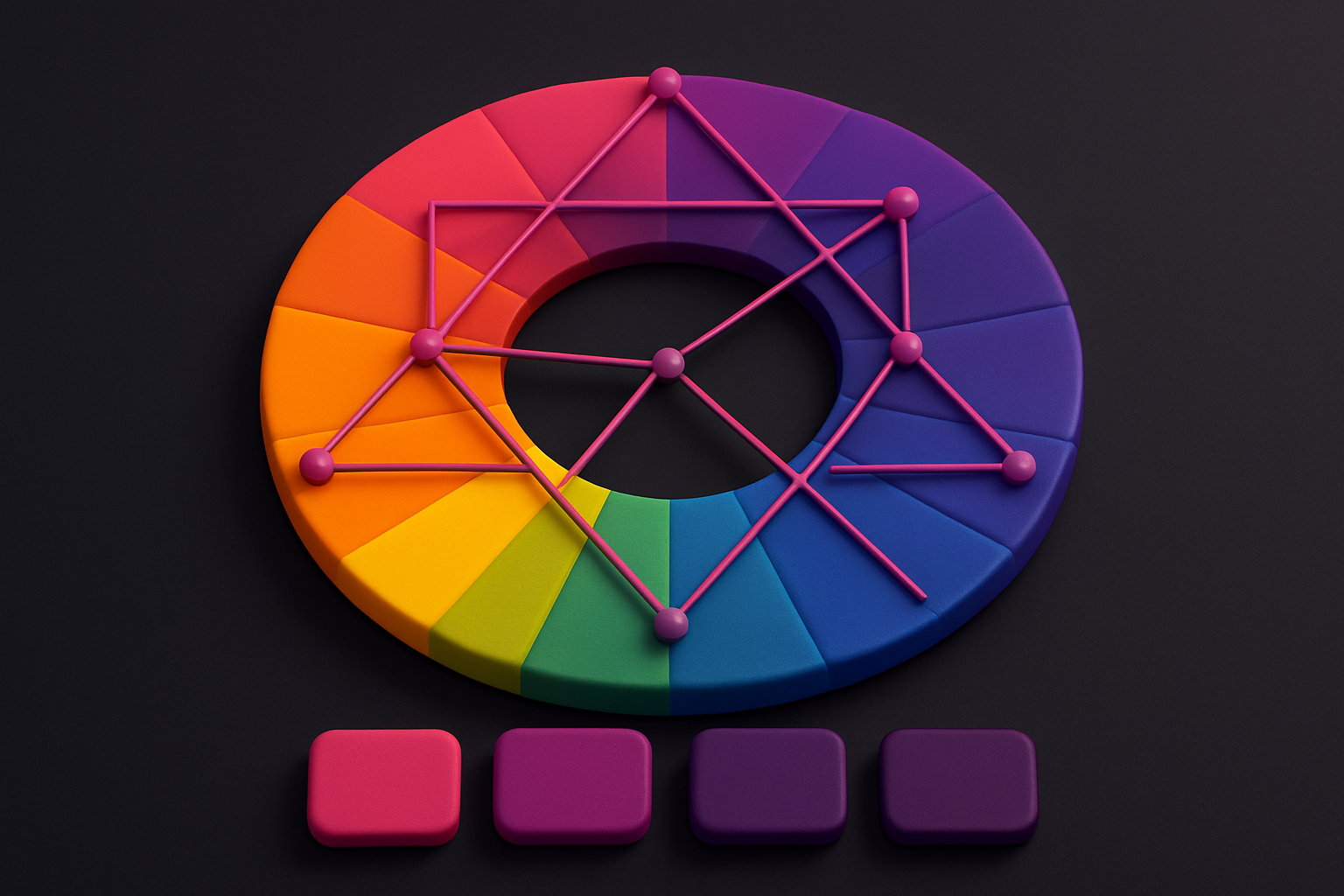
Color Harmony Wheel
Interactive color wheel with five harmony types and visual selection.
Color Tools

Color Picker
Interactive color picker with HEX, RGB, HSL, and CMYK outputs.
Color Tools

CSS Filter Generator
Apply CSS filter effects like blur, brightness, contrast, and more with visual controls.
 CSS & Design

HEX to RGB Converter
Convert HEX color codes to RGB values instantly with a live preview swatch.
Color ToolsFrequently Asked Questions
QWhat is a conic gradient?
QCan I create pie charts with conic gradients?
QIs conic-gradient well supported?
About Conic Gradient Generator
Conic Gradient Generator is a free online tool from FreeToolkit.ai. All processing happens directly in your browser — your data never leaves your device. No registration required. No ads. Just fast, reliable tools.