CSS Divider GeneratorGenerate CSS section dividers with multiple styles including gradient, shadow, and zigzag.
CSS Divider Generator
Generate CSS section dividers with multiple styles including gradient, shadow, and zigzag.
Choose a divider style
Select from solid, dashed, dotted, gradient, double, shadow, zigzag, or fade.
Customize appearance
Adjust colors, thickness, width, and vertical spacing.
Copy the CSS
Preview the divider between content sections and copy the CSS.
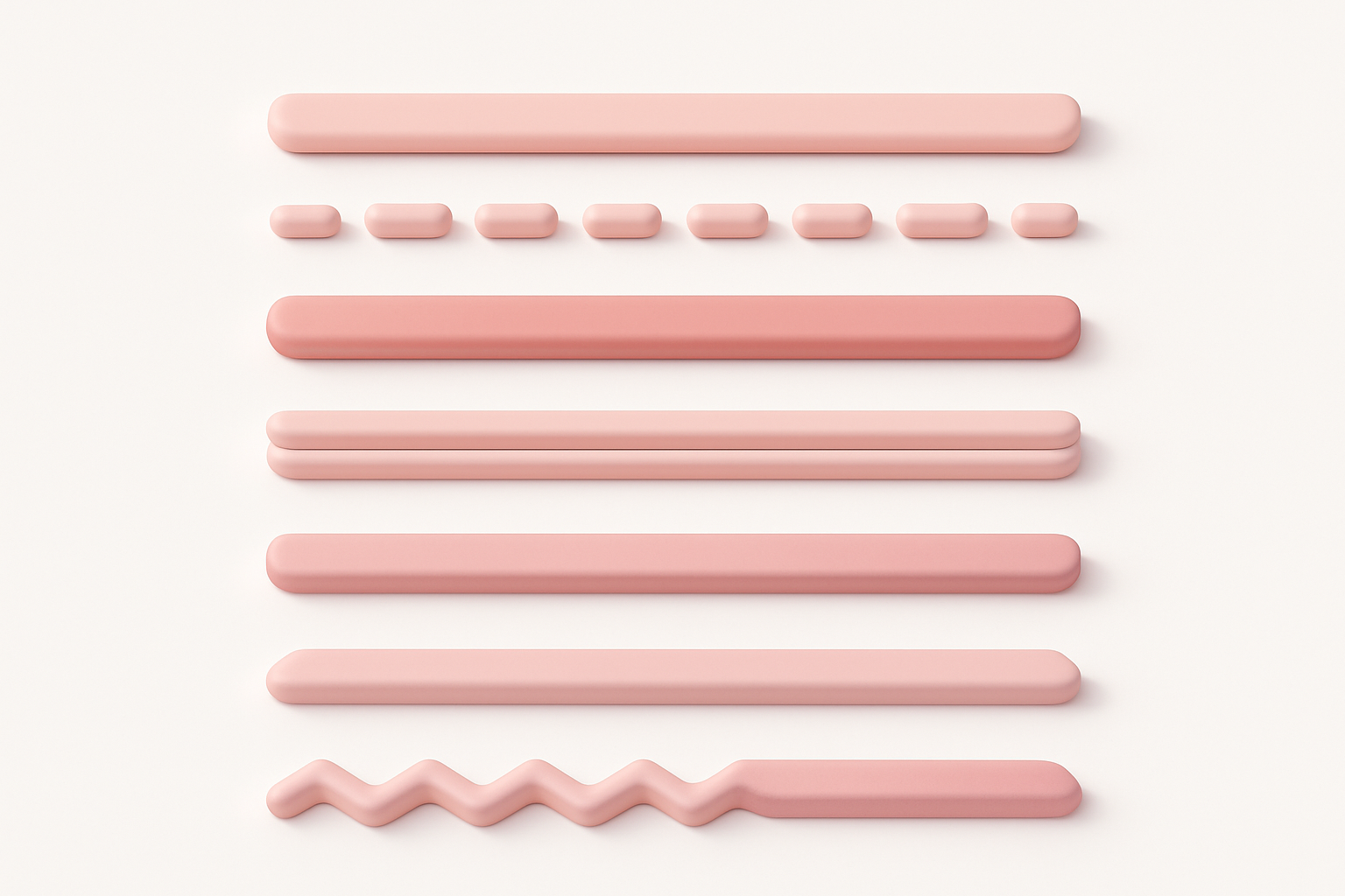
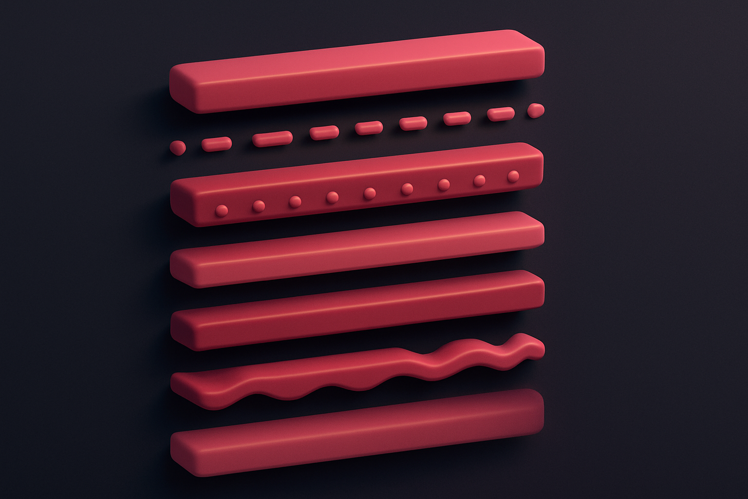
What Is CSS Divider Generator?
The CSS Divider Generator creates section dividers and separators with eight distinct styles. Dividers are horizontal elements that visually separate content sections, improving readability and page organization. This tool offers diverse styles: solid (classic line), dashed (dash pattern), dotted (dot pattern), gradient (smooth color transition), double (two parallel lines), shadow (glowing shadow line), zigzag (pointed wave), and fade (gradient to transparent). Each style can be customized with color, secondary color (for gradients), thickness, width percentage, and vertical margin. The preview shows the divider between sample content sections so you can see how it separates real content.
Why Use Our CSS Divider Generator?
- Eight distinct divider styles from classic to creative
- Customizable colors, thickness, width, and spacing
- Preview between content sections for realistic context
- Pure CSS implementation with no images required
Common Use Cases
Content Sections
Separate articles, features, and content blocks on long pages.
Form Section Breaks
Divide long forms into logical sections with visual separators.
Footer Separation
Add decorative dividers between footer columns and sections.
Card Content Dividers
Separate content sections within card components.
Technical Guide
CSS dividers can be implemented using several techniques. The simplest is a div with a height and background-color. Border-based dividers use border-top with solid, dashed, or dotted styles. Gradient dividers use linear-gradient for smooth color transitions. The fade effect uses a gradient from transparent to the color and back to transparent. Shadow dividers use box-shadow to create a glowing line effect. Zigzag patterns use layered linear-gradients at alternating angles with calculated background-size. Double lines use the border-style: double property. The width percentage and margin: auto centering allow the divider to be narrower than the container for a refined look. For semantic HTML, the <hr> element is the appropriate choice for thematic breaks, styled with CSS to match the desired appearance.
Tips & Best Practices
- 1Use gradient or fade dividers for elegant, modern designs
- 2Keep divider width at 60-80% of container for a refined look
- 3Match divider color to your design palette for consistency
- 4Use adequate margin (24-40px) for clear visual separation
Related Tools


CSS Wave Generator
Generate SVG wave section dividers with customizable waves, height, and colors.
 CSS & Design
CSS Border Radius Generator
Generate CSS border-radius values with per-corner control and visual preview.
CSS & Design
CSS Gradient Generator
Create beautiful linear, radial, and conic CSS gradients with multiple color stops and angle control.
CSS & Design

Spacing Scale Generator
Generate a consistent spacing scale system with customizable base unit and multipliers.
CSS & Design

CSS Box Shadow Generator
Generate CSS box shadows with multiple layers, inset options, and real-time preview.
CSS & Design

CSS Text Shadow Generator
Create CSS text shadows with visual controls for offset, blur, color, and opacity.
CSS & DesignFrequently Asked Questions
QShould I use <hr> or <div> for dividers?
QHow do I center a divider?
QCan I use dividers vertically?
QHow do I make a responsive divider?
QCan I animate the divider?
About CSS Divider Generator
CSS Divider Generator is a free online tool from FreeToolkit.ai. All processing happens directly in your browser — your data never leaves your device. No registration required. No ads. Just fast, reliable tools.